J. C Leyendecker’s art is what I like to call the “Art Style of the 1950s”. Leyendecker’s work is so stereotypically 50s in nature, in fact, that it is continually used by things, such as The Incredibles and Team Fortress 2, to imitate the dress sense and appearance of the era. But why? Why is it that Leyendecker’s work is so memorable and stereotypical to its era that it is continually returned to as a reference point? Well, my answer is that its simplicity and representation of the era is its genius.
You see, Leyendecker’s art is based around bold, blocky colors which are used to, nevertheless, create very detailed portraits and pieces of art. For instance, observe the following illustration:
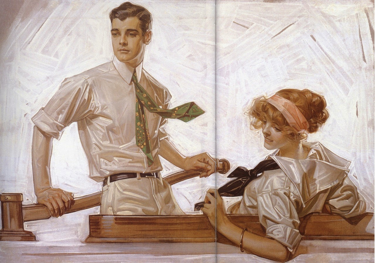
"Arrow Collar Man" - J. C. Leyendecker - 1947
In this image, you can see that the color of each different surface is, essentially, painted in a fashion where they are sub-divided into little blocks to show details. Then, each subsequent block is colored a different, lightly contrasting, color. However, one of the most interesting details about this image is the contrast of colors in general. The foreground and background elements are very clear in their contrast. The skin tone of the man and woman is very distinct to their shirt colors. Similarly, the color of the woon upon which they sit isn’t even in the same saturated range as every other color in the image. However, at the same time, the colors are all complementing: nothing particularly stands out yet they all still contrast enough that individual elements can be picked out. There are no blues on reds or greens on blacks.
One of the best places where this can be seen is in the art style of Team Fortress 2, which heavily used this fact in order to make the game visually distinct and easy to spot important elements (meaning, of course, other players). For instance, observe the following image:
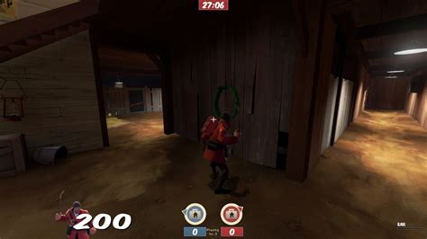
Screenshot from Team Fortress 2 - taken 12/06/2015
In this image, a few things are very apparent. Firstly, the player in the center of the screen is very visually distinct: you can’t miss him. The soldier stands out from the background very easily, despite using the exact same color pallete and using complementing colors. Why is this? The answer is saturation. TF2 ensures that players will always have a much higher level of color saturation to that of the background, meaning that it is really difficult to miss where he is standing. Secondly, you can see exactly whose base you are in. TF2 uses contrasting color palletes to ensure that you can always tell where you are in a level at any time. Observe these two images:


Which team do you think occupies each part of the map? To even the minimum of pertinent observers, it is fairly obvious that the left base is occupied by blue, whereas the right goes to red. This is entirely down to Leyendecker’s genius of contrast: everything was based on color. Whereas a lot of art uses other techniques to contrast things (such as positive and negative space), Leyendecker could place two different objects right next to each other (maybe even inside each other) and still have the eye naturally contrast them.
Now, I said in the outset that Leyendecker’s art tends to just scream “1950s”. And, I think that is very accurate. But why is this, specifically? Well, my theory is that Leyendecker’s style is just an evolved version of pop art. Pop art is also well known for being based around blocky, shaded sections which are built up using contrasting colors. Just look up 50s art (here, I’ve done it for you) and you will see that this type of artistry was very popular in 50s and 60s advertising. There could be a number of reasons behind this, but, again, my theory is that it was both cheaper and more practical to reproduce this style. There was no such thing as a photocopier in the 50s and camera quality was nowhere near good enough to be used for this purpose. As such, artists attempted to use as much of the same shades as possible. This created the distinctive style that Leyendecker is known for. It is also possible that the limited color pallete that technicolor cameras (and art in general) allowed for was simply being used to the greatest effect possible while still maintaining a degree of realism.
In summary, Leyendecker’s art is something that we really have lost with the advent of accurate and cheap digital cameras. And it is a shame. There is a reason that games such as Team Fortress 2 are often described as looking quite beautiful by players: because it is based on a beautiful art style: an art style which Leyendecker exemplified.